Ease comparisons
Rafael Irizarry
Use common axes
Since there are so many points, it is more effective to show distributions rather than individual points. We therefore show histograms for each group:
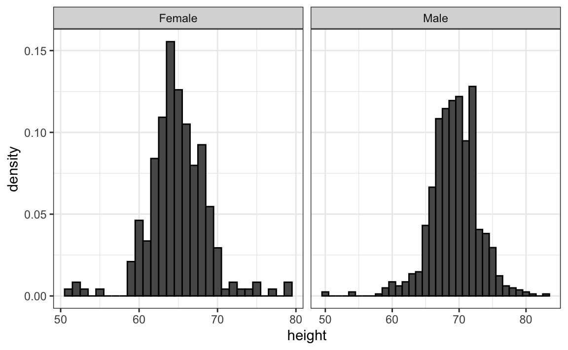
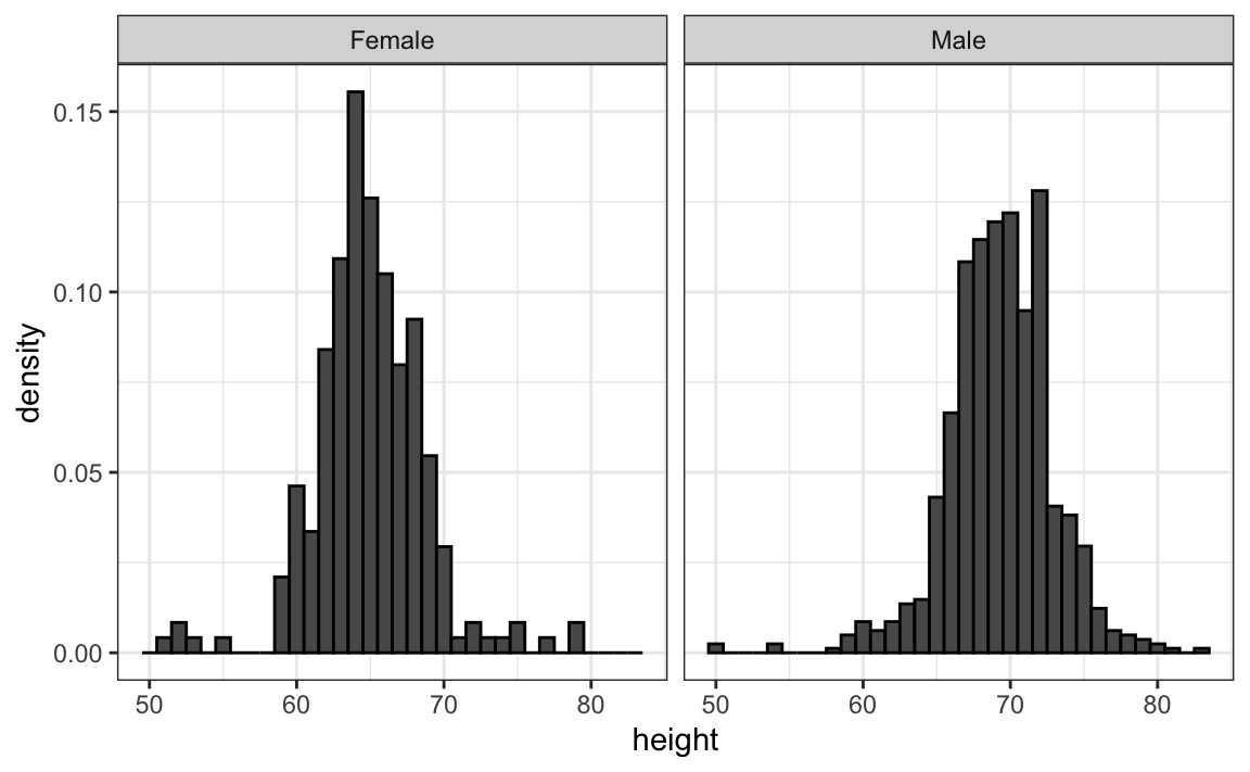
However, from this plot it is not immediately obvious that males are, on average, taller than females. We have to look carefully to notice that the x-axis has a higher range of values in the male histogram. An important principle here is to keep the axes the same when comparing data across two plots. Below we see how the comparison becomes easier:
Align plots vertically to see horizontal changes and horizontally to see vertical changes
In these histograms, the visual cue related to decreases or increases in height are shifts to the left or right, respectively: horizontal changes. Aligning the plots vertically helps us see this change when the axes are fixed:
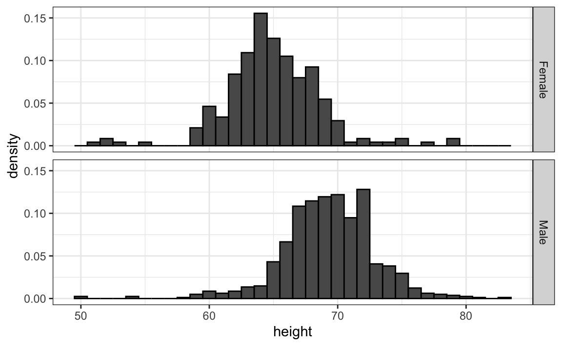
This plot makes it much easier to notice that men are, on average, taller.
If , we want the more compact summary provided by boxplots, we then align them horizontally since, by default, boxplots move up and down with changes in height. Following our show the data principle, we then overlay all the data points:
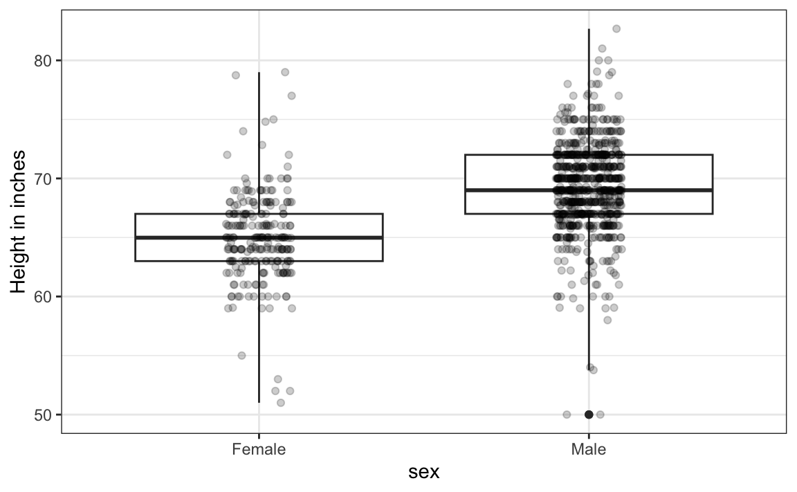
Now contrast and compare these three plots, based on exactly the same data:
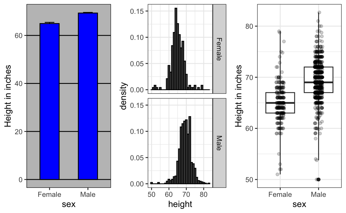
Notice how much more we learn from the two plots on the right. Barplots are useful for showing one number, but not very useful when we want to describe distributions.
Consider transformations
We have motivated the use of the log transformation in cases where the changes are multiplicative. Population size was an example in which we found a log transformation to yield a more informative transformation.
The combination of an incorrectly chosen barplot and a failure to use a log transformation when one is merited can be particularly distorting. As an example, consider this barplot showing the average population sizes for each continent in 2015:
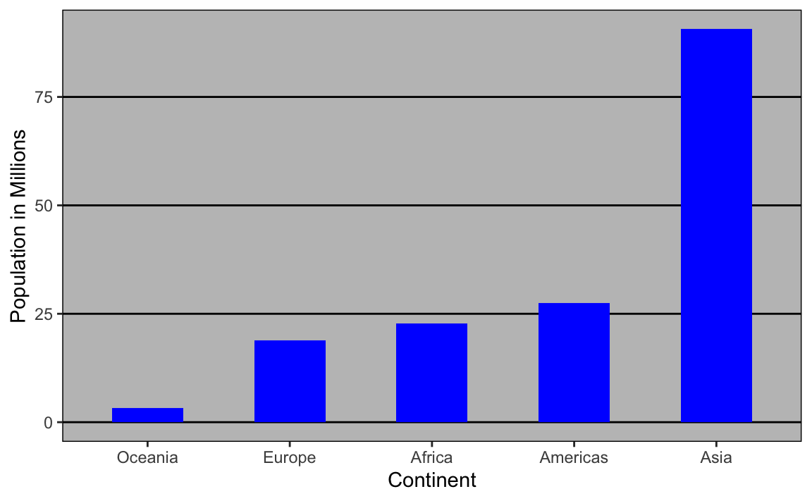
From this plot, one would conclude that countries in Asia are much more populous than in other continents. Following the show the data principle, we quickly notice that this is due to two very large countries, which we assume are India and China:
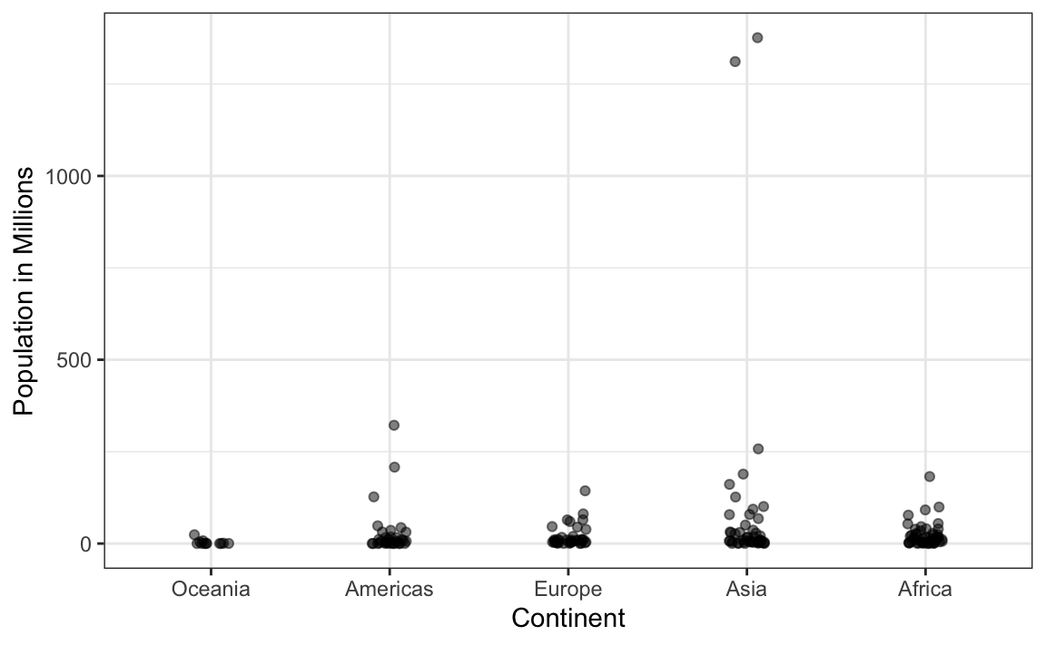
Using a log transformation here provides a much more informative plot. We compare the original barplot to a boxplot using the log scale transformation for the y-axis:
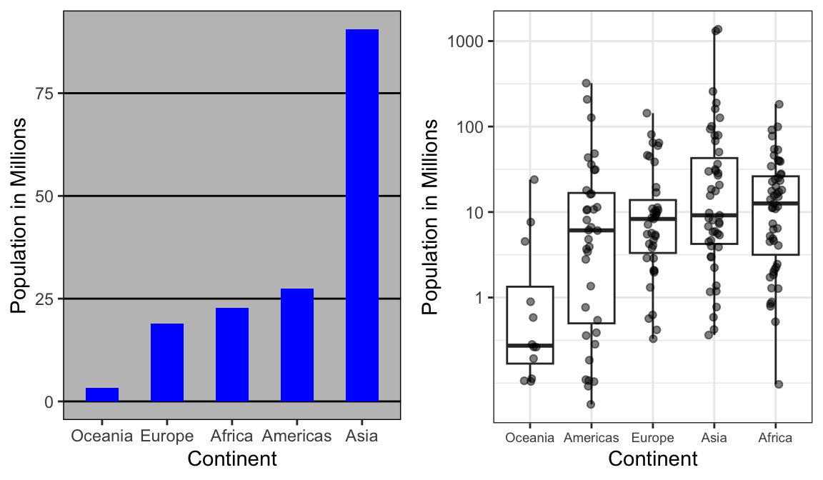
With the new plot, we realize that countries in Africa actually have a larger median population size than those in Asia.
Other transformations you should consider are the logistic transformation (logit), useful to better see fold changes in odds, and the square root transformation (sqrt), useful for count data.
Visual cues to be compared should be adjacent
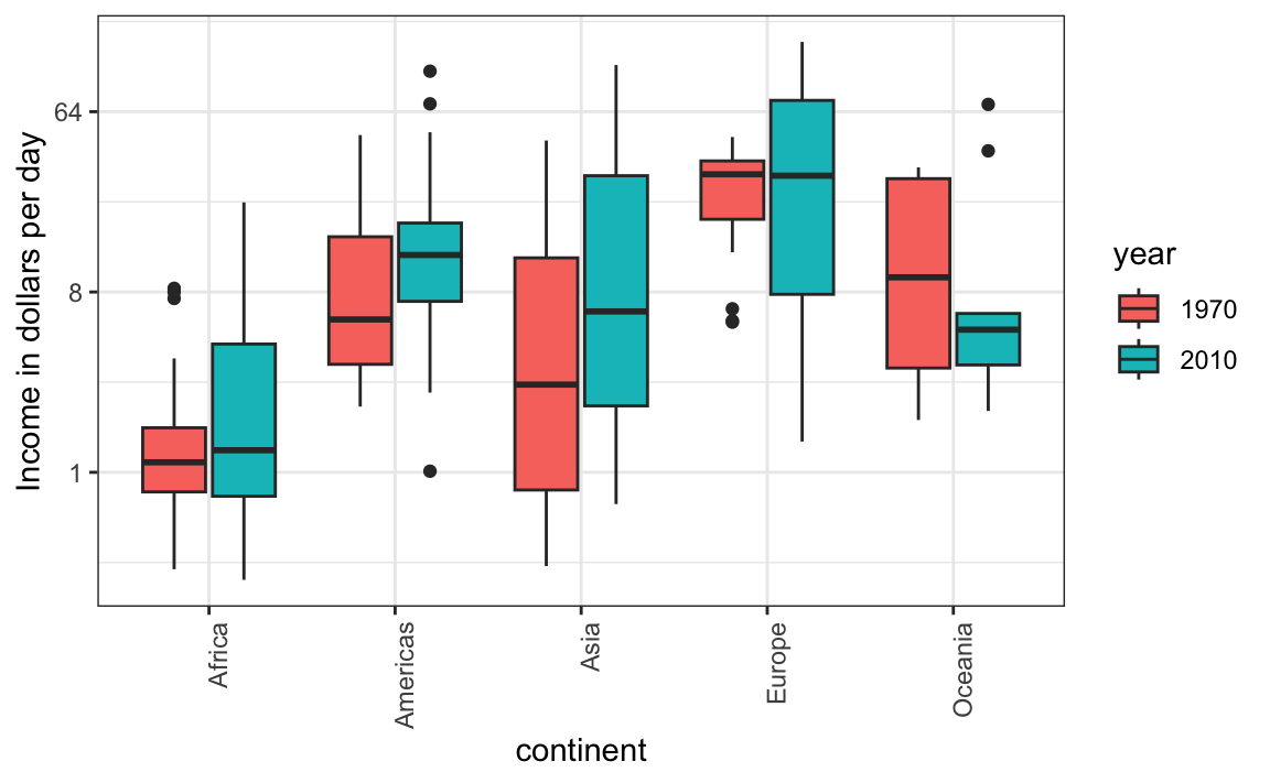
For each continent, let’s compare income in 1970 versus 2010. When comparing income data across regions between 1970 and 2010, we made a figure similar to the one below, but this time we investigate continents rather than regions.
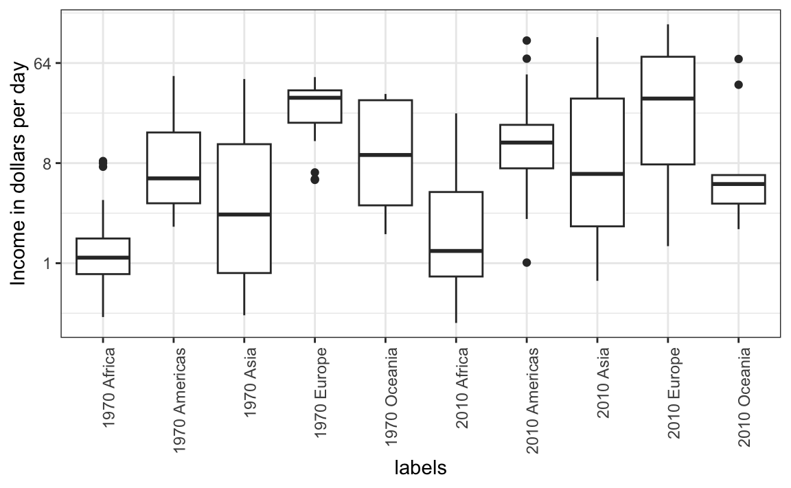
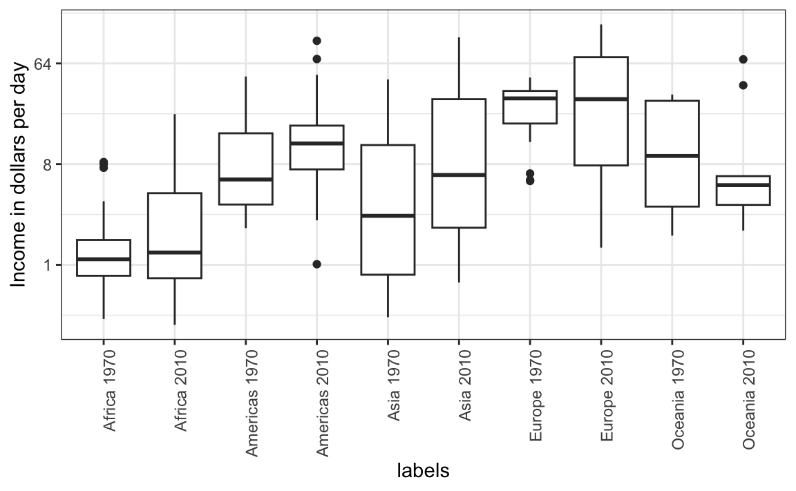
The default is to order labels alphabetically so the labels with 1970 come before the labels with 2010, making the comparisons challenging because a continent’s distribution in 1970 is visually far from its distribution in 2010. It is much easier to make the comparison between 1970 and 2010 for each continent when the boxplots for that continent are next to each other:
Use color
The comparison becomes even easier to make if we use color to denote the two things we want to compare: