Encoding a third variable
Rafael Irizarry
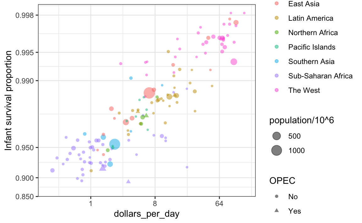
Below is a scatterplot showing the relationship between infant survival and average income. It also encodes three variables: OPEC membership, region, and population.
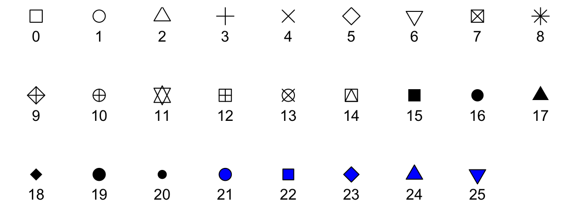
It encodes categorical variables with color and shape. These shapes can be controlled with shape argument. Below are the shapes available for use in R package. For the last five, the color goes inside.
For continuous variables, we can use color, intensity, or size. We now show an example of how we do this with a case study.
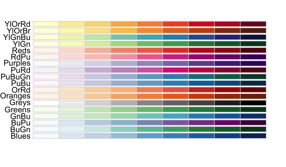
When selecting colors to quantify a numeric variable, we choose between two options: sequential and diverging. Sequential colors are suited for data that goes from high to low. High values are clearly distinguished from low values. Here are some examples.
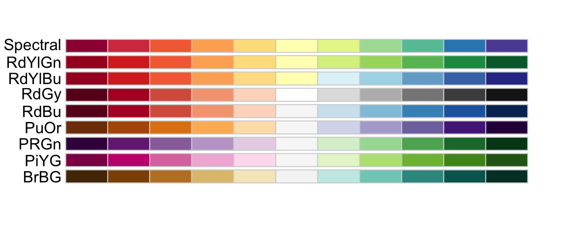
Diverging colors are used to represent values that diverge from a center. We put equal emphasis on both ends of the data range: higher than the center and lower than the center. An example of when we would use a divergent pattern would be if we were to show height in standard deviations away from the average. Here are some examples of divergent patterns: