Filtering features
Rafael Irizarry
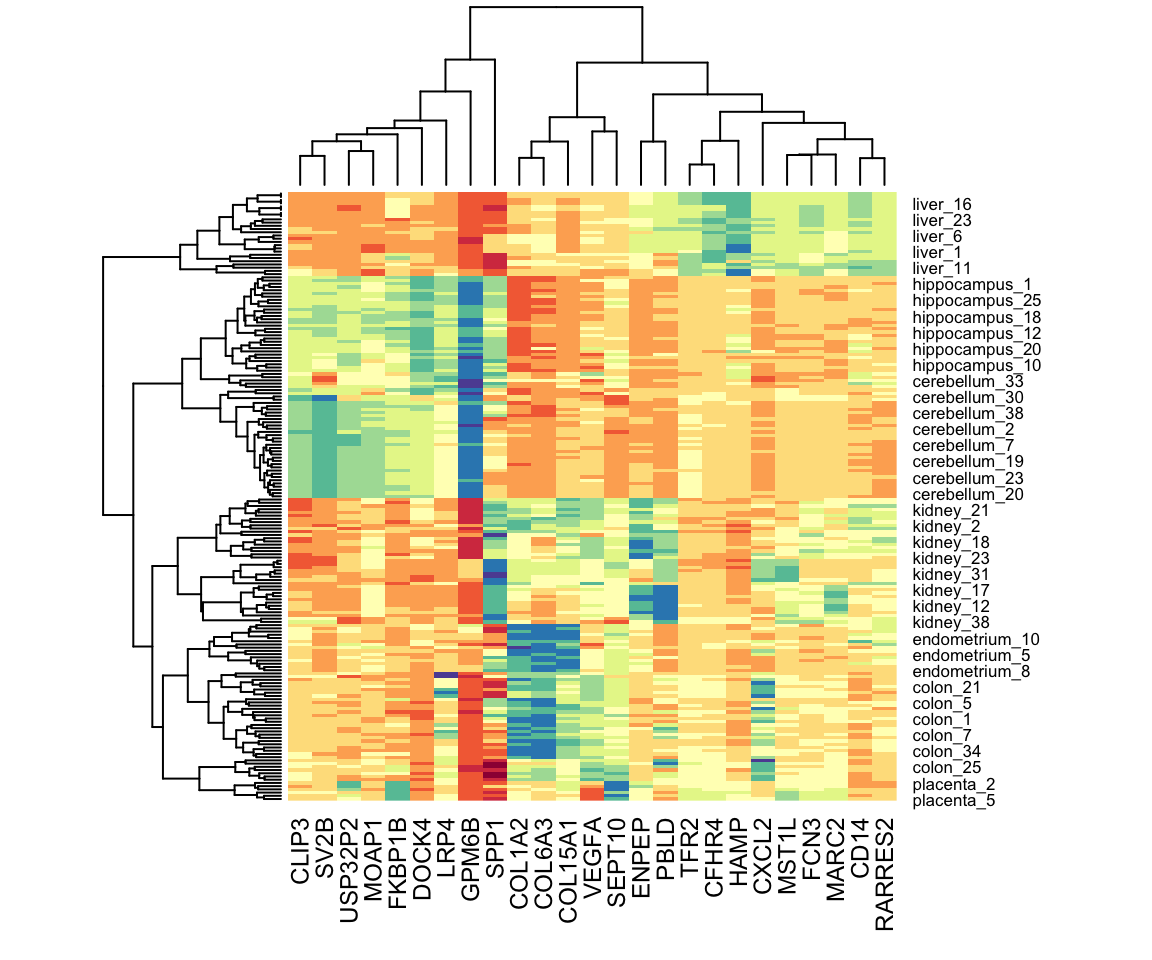
A powerful visualization tool for discovering clusters or patterns in your data is the heatmap. The idea is simple: plot an image of your data matrix with colors used as the visual cue and both the columns and rows ordered according to the results of a clustering algorithm.
If the information about clusters is included in just a few features, including all the features can add enough noise that detecting clusters becomes challenging. One simple approach to try to remove features with no information is to only include those with high variance. In the movie example, a user with low variance in their ratings is not really informative: all the movies seem about the same to them. Here is an example of how we can include only the features with high variance.