Know when to include Zero

Rafael Irizarry

When using barplots, it is misinformative not to start the bars at 0. This is because, by using a barplot, we are implying the length is proportional to the quantities being displayed. By avoiding 0, relatively small differences can be made to look much bigger than they actually are. This approach is often used by politicians or media organizations trying to exaggerate a difference. Below is an illustrative example used by Peter Aldhous.

Bar graph titled "Southwest Border Apprehensions" shows an increase from October of 2011 to April of 2013. The x-axis measures in years, ranging 2011 to 2013. The y-axis measures number of apprehensions ranging from 155,000 to 195,000, lacking a zero. Source: U.S. Border Patrol.
A bar graph showing increases in southwest border apprehensions from 2011 to 2013. Source: Fox News, via Media Matters

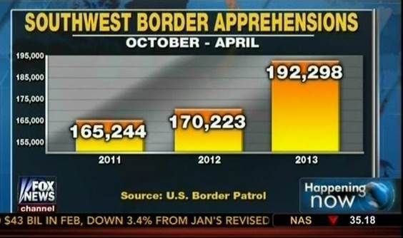
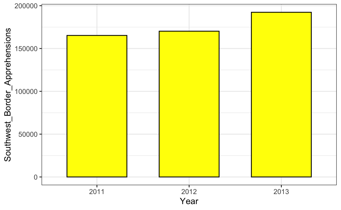
From the plot above, it appears that apprehensions have almost tripled when, in fact, they have only increased by about 16%. Starting the graph at 0 illustrates this clearly:

A recreation of the bar graph beforehand. This line graph recreates the data, but uses a zero on the y-axis, showing the difference in scale.
A recreation of the original Fox News border apprehensions bar graph, but with a zero on it’s y-axis.

Here is another example, described in detail in a Flowing Data blog post:

A bar graph showing a projected tax rate increase from 35% to 42% between 2012 and 2013.
A bar graph illustrating a projected change in tax rate. Source: Fox News, via Flowing Data

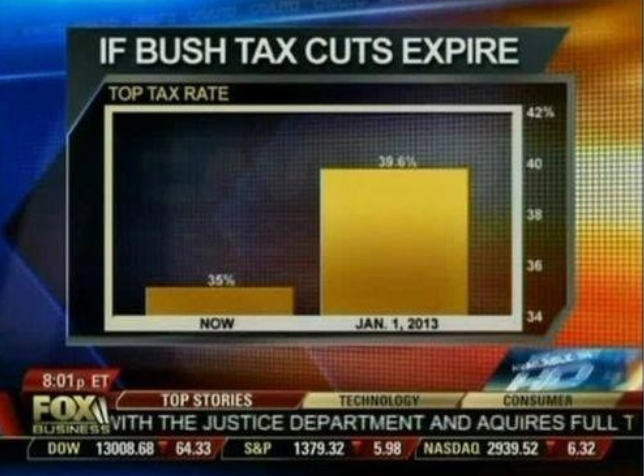
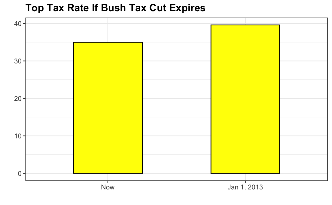
This plot makes a 13% increase look like a five fold change. Here is the appropriate plot:

A recreation of the tax cut bar graph shown above. It has been changed to add a zero to the y-axis.
A recreation of the tax cuts bar graph, but with a zero added to it’s y-axis.

Finally, here is an extreme example that makes a very small difference of under 2% look like a 10-100 fold change:

An image showing the election results of a Venezuelan presidential election from 2013. Due to the way the values are represented, the second candidate appears to be receiving significantly less votes. There is no x or y axis labeled.
A news broadcast showing Venezuelan election results exaggerates polling numbers. Source: Venezolana de Televisión via Pakistan Today and Diego Mariano.

Here is the appropriate plot:

A revised version of the previous election graph. In this bar graph, the results are very close to one another other.
A revised version of the previous data, with more appropriate scaling.

When using position rather than length, it is then not necessary to include 0. This is particularly the case when we want to compare differences between groups relative to the within-group variability. Here is an illustrative example showing country average life expectancy stratified across continents in 2012:

Two dot plots showing changes in life expectancy from continent to continent. Their scales change greatly when a zero is added or removed.

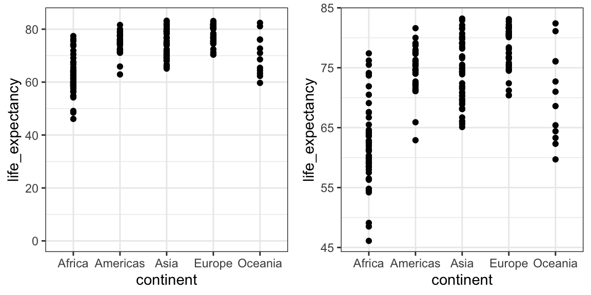
Note that in the plot on the left, which includes 0, the space between 0 and 43 adds no information and makes it harder to compare the between and within group variability.

License

Icon for the Creative Commons Attribution-NonCommercial-ShareAlike 4.0 International License

Business Analytics Copyright © by Rafael Irizarry is licensed under a Creative Commons Attribution-NonCommercial-ShareAlike 4.0 International License, except where otherwise noted.

Share This Book