
Show the data
Rafael Irizarry
We have focused on displaying single quantities across categories. We now shift our attention to displaying data, with a focus on comparing groups.
Let’s assume ET is interested in the difference in heights between males and females. A commonly seen plot used for comparisons between groups, popularized by software such as Microsoft Excel, is the dynamite plot, which shows the average and standard errors (standard errors are defined in a later chapter, but do not confuse them with the standard deviation of the data). The plot looks like this:
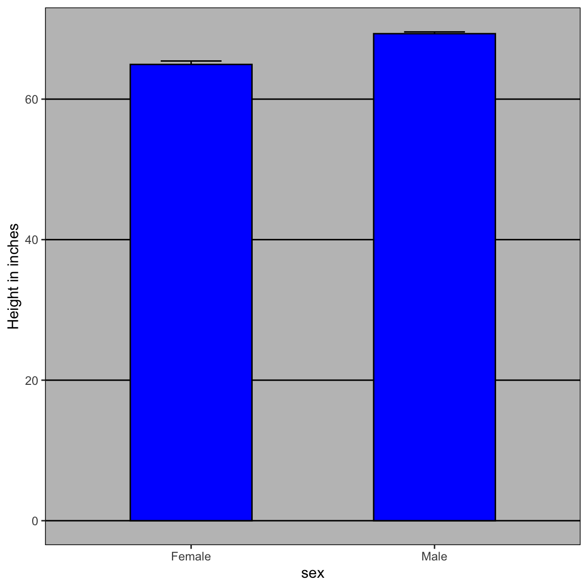
The average of each group is represented by the top of each bar and the antennae extend out from the average to the average plus two standard errors. If all ET receives is this plot, he will have little information on what to expect if he meets a group of human males and females. The bars go to 0: does this mean there are tiny humans measuring less than one foot? Are all males taller than the tallest females? Is there a range of heights? ET can’t answer these questions since we have provided almost no information on the height distribution.
This brings us to our first principle: show the data. This is a more informative plot than the barplot by simply showing all the data points:
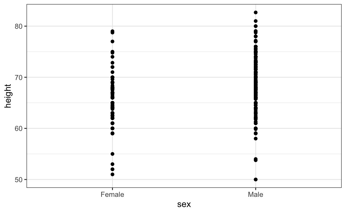
For example, this plot gives us an idea of the range of the data. However, this plot has limitations as well, since we can’t really see all the 238 and 812 points plotted for females and males, respectively, and many points are plotted on top of each other. As we have previously described, visualizing the distribution is much more informative. But before doing this, we point out two ways we can improve a plot showing all the points.
The first is to add jitter, which adds a small random shift to each point. In this case, adding horizontal jitter does not alter the interpretation, since the point heights do not change, but we minimize the number of points that fall on top of each other and, therefore, get a better visual sense of how the data is distributed. A second improvement comes from using alpha blending: making the points somewhat transparent. The more points fall on top of each other, the darker the plot, which also helps us get a sense of how the points are distributed. Here is the same plot with jitter and alpha blending:
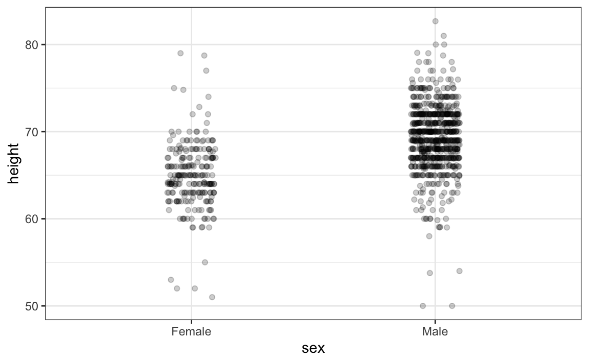
Now we start getting a sense that, on average, males are taller than females. We also note dark horizontal bands of points, demonstrating that many report values that are rounded to the nearest integer.
