
Visual Interpretation
Christoph Molnar
Various visualizations make the linear regression model easy and quick to grasp for humans.
Weight Plot
The information of the weight table (weight and variance estimates) can be visualized in a weight plot. The following plot shows the results from the previous linear regression model.
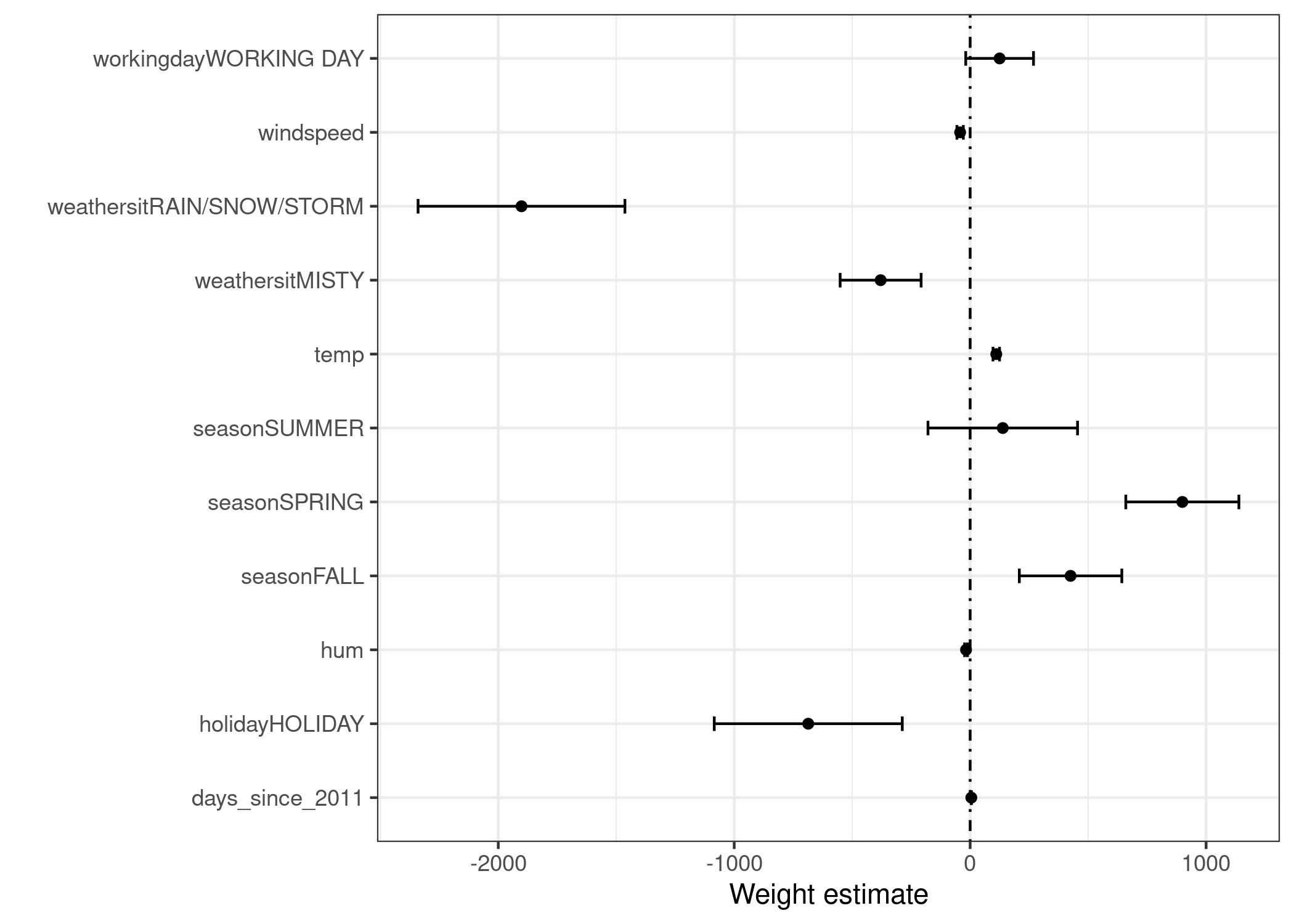
The weight plot shows that rainy/snowy/stormy weather has a strong negative effect on the predicted number of bikes. The weight of the working day feature is close to zero and zero is included in the 95% interval, which means that the effect is not statistically significant. Some confidence intervals are very short and the estimates are close to zero, yet the feature effects were statistically significant. Temperature is one such candidate. The problem with the weight plot is that the features are measured on different scales. While for the weather the estimated weight reflects the difference between good and rainy/stormy/snowy weather, for temperature it only reflects an increase of 1 degree Celsius. You can make the estimated weights more comparable by scaling the features (zero mean and standard deviation of one) before fitting the linear model.
Effect Plot
The weights of the linear regression model can be more meaningfully analyzed when they are multiplied by the actual feature values. The weights depend on the scale of the features and will be different if you have a feature that measures e.g. a person’s height and you switch from meter to centimeter. The weight will change, but the actual effects in your data will not. It is also important to know the distribution of your feature in the data, because if you have a very low variance, it means that almost all instances have similar contribution from this feature. The effect plot can help you understand how much the combination of weight and feature contributes to the predictions in your data. Start by calculating the effects, which is the weight per feature times the feature value of an instance:

The effects can be visualized with boxplots. The box in a boxplot contains the effect range for half of the data (25% to 75% effect quantiles). The vertical line in the box is the median effect, i.e. 50% of the instances have a lower and the other half a higher effect on the prediction. The dots are outliers, defined as points that are more than 1.5 * IQR (interquartile range, that is, the difference between the first and third quartiles) above the third quartile, or less than 1.5 * IQR below the first quartile. The two horizontal lines, called the lower and upper whiskers, connect the points below the first quartile and above the third quartile that are not outliers. If there are no outliers the whiskers will extend to the minimum and maximum values.
The categorical feature effects can be summarized in a single boxplot, compared to the weight plot, where each category has its own row.
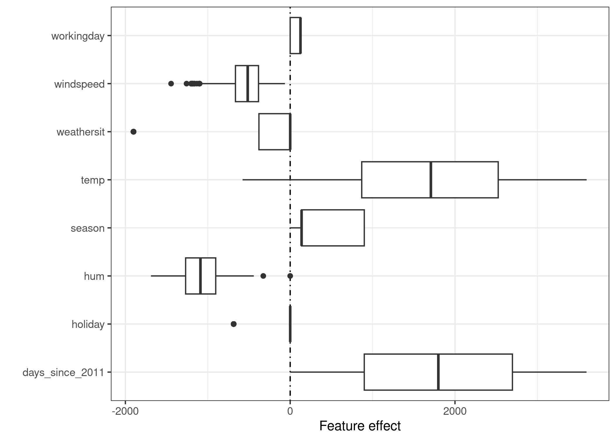
The largest contributions to the expected number of rented bicycles comes from the temperature feature and the days feature, which captures the trend of bike rentals over time. The temperature has a broad range of how much it contributes to the prediction. The day trend feature goes from zero to large positive contributions, because the first day in the dataset (01.01.2011) has a very small trend effect and the estimated weight for this feature is positive (4.93). This means that the effect increases with each day and is highest for the last day in the dataset (31.12.2012). Note that for effects with a negative weight, the instances with a positive effect are those that have a negative feature value. For example, days with a high negative effect of windspeed are the ones with high wind speeds.
